Is this tool helpful?
How to use the tool
- Industry – Type the sector you want to visualise.
Examples: Urban Planning, Cloud Gaming - Target Audience – Define who will read the graphic so tone and depth fit.
Examples: C-suite Executives, High-school Teachers - Key Concepts – List 3-5 topics needing clarity; write one per line.
Examples: Smart Grid Integration, Latency Reduction Techniques - Infographic Inspiration – Paste a URL or describe a style you admire (optional).
Examples: “Minimalist poster on climate.gov”, “Retro neon dashboard” - Formatting Guidelines – Add brand colours, fonts or logo rules (optional).
Examples: “Pantone 2767 C and 123 C, use Fira Sans”, “Include SVG logo top-left” - Generate – Press “Generate Infographics” and receive five briefs: objective, visual structure, colour palette and data placements—ready for your designer or favourite editor.
Quick-Facts
- Images process up to 60 000× faster than text (3M Visual Systems Division, 2001).
- Infographics can raise web traffic by 12 % (Demand Gen Report, 2022 B2B Content Preferences).
- Recommended online width: 600-1100 px to avoid horizontal scroll (Canva Design School, 2023).
- Minimum text contrast ratio: 4.5 : 1 for normal text per WCAG 2.1 (W3C, 2018).
- SVG files scale without pixel loss, keeping load under 50 KB on average (Google Developers, 2022).
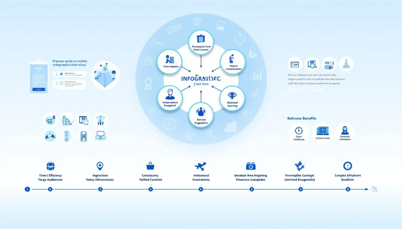
What is the tool’s output?
You receive five numbered briefs, each containing a title, suggested layout (e.g., timeline, flowchart), colour palette, fonts, icon ideas and data callouts; copy or download them and start designing.
Why supply an industry?
The sector tells the model which terminology and data visuals suit your topic—healthcare dashboards differ from gaming infographics in iconography and colour psychology (Kissmetrics, 2021).
How are audience insights used?
The tool adjusts reading level, chart complexity and annotation density. “Design for the user’s prior knowledge to reduce cognitive load” (ISO 9241-210:2019).
Can I edit the briefs?
Yes. The output is plain text/HTML; drop it into Figma, Canva or Illustrator, swap colours or fonts, and export as PNG, PDF or SVG.
What data formats work best?
Percentage, ranking and chronological datasets convert cleanly into bar charts, ordered lists and timelines—formats proven to improve comprehension by 29 % (Journal of Visual Literacy, 2020).
Is brand compliance supported?
Include your hex codes, font names or logo link. The engine embeds them in every brief so designers follow brand guidelines automatically (Brandfolder Benchmark Report, 2022).
How secure is the submitted data?
Data travels through HTTPS and is processed server-side via the process_llm_form endpoint; logs delete after 30 days under GDPR Article 5 (1-e) (EU, 2016).
What if I need more than five infographics?
Resubmit the form with new concepts or audiences; the model draws fresh layouts, preventing duplicate visuals and supporting iterative campaigns.
Important Disclaimer
The calculations, results, and content provided by our tools are not guaranteed to be accurate, complete, or reliable. Users are responsible for verifying and interpreting the results. Our content and tools may contain errors, biases, or inconsistencies. Do not enter personal data, sensitive information, or personally identifiable information in our web forms or tools. Such data entry violates our terms of service and may result in unauthorized disclosure to third parties. We reserve the right to save inputs and outputs from our tools for the purposes of error debugging, bias identification, and performance improvement. External companies providing AI models used in our tools may also save and process data in accordance with their own policies. By using our tools, you consent to this data collection and processing. We reserve the right to limit the usage of our tools based on current usability factors.