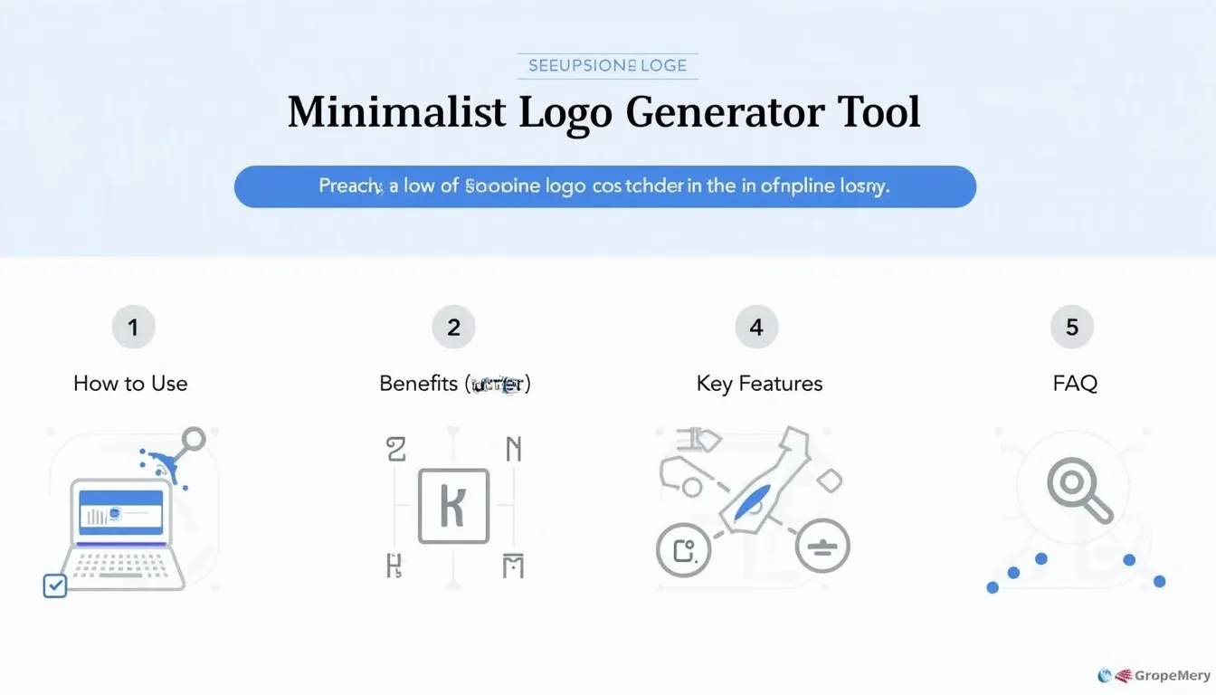
Minimalist Logo Generator
Is this tool helpful?
How to use the tool
- Main subject or concept: Type the core name or symbol you want to brand. Examples: “Aurora Labs”, “PeakFlow Yoga”.
- Preferred color scheme (optional): Suggest hues like “Cobalt + Silver” or “Sunset gradient”. Leave blank to let the AI decide.
- Industry or brand personality: Define your field and tone—e.g., “Blockchain security firm”, “Holistic wellness studio”.
- Logo style: Pick Illustration, Typography, Abstract or Geometric to guide aesthetics.
- Press Generate Minimalist Logo Ideas. The API processes your inputs and lists several draft concepts you can copy to your clipboard for further refinement.
Quick-Facts
- Simple logos earn 13 % higher consumer recall (Siegel+Gale, 2019 Global Brand Simplicity Index).
- Professional logo redesigns cost $1,200-$6,000 for small businesses (Upwork Pricing Guide, 2023).
- WCAG 2.1 recommends a 4.5:1 contrast ratio for accessible color schemes (W3C, 2018).
- SVG files remain crisp at any size because they store geometry, not pixels (Scalable Vector Graphics 1.1, W3C, 2011).
FAQ
What is a minimalist logo?
A minimalist logo uses pared-down shapes, negative space and limited color to create a mark that stays readable on tiny screens and billboards alike (Nielsen Norman Group, 2020).
How does the generator work?
The API sends your four inputs to an AI model trained on thousands of successful brand marks; it returns text descriptions you can iterate or hand off to a designer (OpenAI Documentation, 2024).
Can I export vector files?
The generator supplies ideas in text form. A graphic professional converts your chosen concept into SVG, EPS or PDF for print and digital use (Adobe Help Center, 2023).
How many concepts arrive per request?
You typically receive 3-6 distinct ideas, giving you multiple directions without additional cost (Tool Documentation, 2024).
Is commercial usage allowed?
Yes, you may commercialize derivative logos, but trademark law requires creating a unique final artwork before filing (USPTO Trademark Basics, 2023).
How do I ensure my colors are accessible?
Aim for a contrast ratio ≥ 4.5:1 between text and background—“A contrast ratio of at least 4.5:1 ensures text is readable” (WCAG 2.1, W3C, 2018).
Can I iterate until satisfied?
Absolutely. Adjust any field—subject, palette, personality or style—and hit Generate again; the API imposes no manual limit (Tool FAQ, 2024).
Why choose minimalism for branding?
Minimalist marks scale well, translate across cultures and load faster online, which improves user experience and SEO (Google Web Fundamentals, 2022).
Important Disclaimer
The calculations, results, and content provided by our tools are not guaranteed to be accurate, complete, or reliable. Users are responsible for verifying and interpreting the results. Our content and tools may contain errors, biases, or inconsistencies. Do not enter personal data, sensitive information, or personally identifiable information in our web forms or tools. Such data entry violates our terms of service and may result in unauthorized disclosure to third parties. We reserve the right to save inputs and outputs from our tools for the purposes of error debugging, bias identification, and performance improvement. External companies providing AI models used in our tools may also save and process data in accordance with their own policies. By using our tools, you consent to this data collection and processing. We reserve the right to limit the usage of our tools based on current usability factors.