Is this tool helpful?
How to Use the Brand Typography System Designer Effectively
This tool helps you build a professional brand typography system by guiding you through essential inputs. To get the best results, provide clear and detailed information in each field. Here’s how to fill out the form with examples different from the default placeholders:
Input Fields Explained
-
Brand Name: Enter your brand or company name to personalize your typography system.
- Example 1: “Evergreen Consulting”
- Example 2: “Brightwave Technologies”
-
Brand Personality: Describe the character of your brand to shape the font style accordingly.
- Example 1: “Minimalistic, modern, and professional with a focus on innovation and clarity.”
- Example 2: “Warm, approachable, and community-oriented with a creative and playful tone.”
-
Target Audience: Define who your main customers or users are to ensure typography relevance.
- Example 1: “Small business owners aged 30-45, tech-savvy and seeking scalable solutions.”
- Example 2: “Creative freelancers and design professionals, mostly millennials interested in aesthetics.”
-
Usage Purposes: List all platforms and media where your typography will appear.
- Example 1: “Corporate website, printed annual reports, and social media campaigns.”
- Example 2: “Mobile app interfaces, digital advertisements, and email newsletters.”
-
Specific Challenges: Mention any unique requirements or constraints for your typography system (this field is optional).
- Example 1: “Must support high-contrast colors for visually impaired users.”
- Example 2: “Requires compatibility with various international alphabets including Cyrillic and Arabic.”
What Is a Brand Typography System and Why It Matters
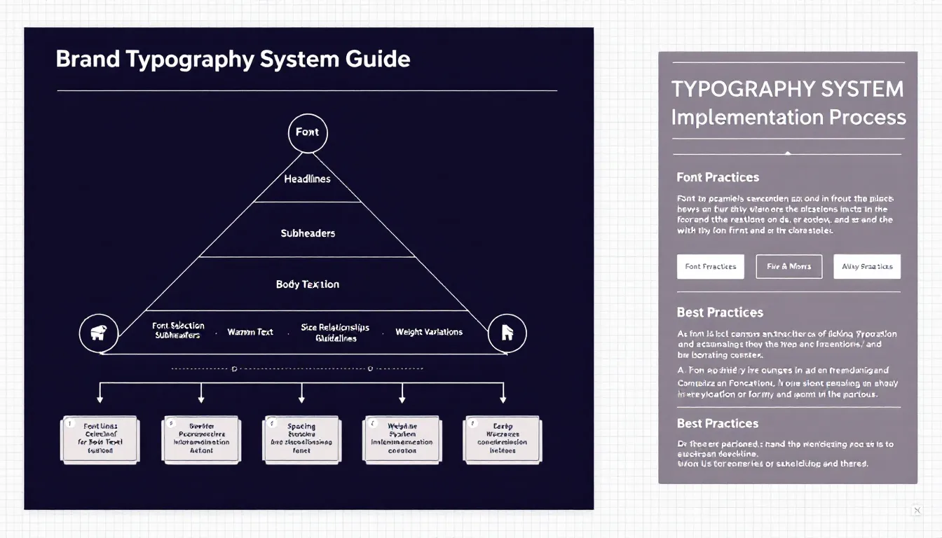
A brand typography system is a set of rules and guidelines that define how fonts are used consistently across all your brand communications. It includes font choices, sizes, weights, spacing, and hierarchies to create a unified and recognizable visual language.
Key Elements of a Typography System
- Selection of primary and secondary typefaces aligned with your brand personality
- Clear font hierarchy to communicate information effectively
- Specifications for letter spacing, line height, and scaling
- Guidelines for font weight usage to emphasize content
- Size relationships for different headings, body text, and captions
Benefits of Using the Brand Typography System Designer
1. Ensure Brand Consistency
You create visual uniformity across all touchpoints, making your brand easily recognizable and professional.
2. Save Time and Resources
Avoid repetitive typography decisions by having clear, reusable guidelines that speed up design and development processes.
3. Develop Professional Documentation
Generate detailed, shareable guidelines that team members and external collaborators can follow.
4. Optimize for Accessibility
Ensure your typography maintains readability and meets accessibility standards for diverse audiences.
Practical Applications of the Typography System Designer
Cross-Platform Typography Consistency
This tool helps maintain consistent font usage and style across websites, mobile apps, printed materials, and more.
Reflecting Brand Personality Through Typography
Translate your brand’s character into thoughtful font choices that support your messaging and audience engagement.
Ensuring Technical Compatibility
Receive recommendations that work well across devices, browsers, and operating systems, avoiding display issues.
Examples of Typography System Use Cases
Case Study 1: SaaS Platform Brand Refresh
A software company revamped its visual identity using a typography system that:
- Used a modern sans-serif font for clean, digital-friendly interfaces
- Incorporated medium and bold font weights for emphasis
- Balanced spacing for readability on diverse screen sizes
- Included multi-language font support for global users
Case Study 2: Nonprofit Organization
A nonprofit developed a typography system to improve accessibility and engagement:
- Selected highly legible fonts with dyslexia-friendly features
- Used color contrast guidelines for visually impaired audiences
- Defined header styles to improve content scanning
- Adapted fonts for print brochures and online articles
Best Practices for Creating Your Typography System
Implementing Clear Hierarchies
- Use size differences to guide readers through content logically
- Apply font weight variations deliberately to highlight key points
- Maintain consistent spacing ratios for a balanced layout
- Define distinct roles for each font style within your system
Making Typography Responsive
- Scale font sizes proportionally across devices and screen resolutions
- Adjust line heights for optimal readability on smaller or larger screens
- Optimize letter spacing to avoid crowded or uneven text
- Ensure sufficient contrast between text and backgrounds for clarity
Frequently Asked Questions About Brand Typography Systems
How many fonts should I include in my brand typography system?
Typically, 2-3 fonts suffice: a primary font for headlines, a secondary font for body copy, and an optional accent font for special applications.
Can I include custom fonts in my typography system?
Yes. The tool supports custom fonts and will recommend alternatives that work across web and print environments.
How can I ensure typography consistency across different teams?
The typography system you generate consists of detailed documentation that acts as a style guide for designers, developers, and marketers.
Should I adapt my typography system for different markets?
Yes, you can adapt typography for cultural preferences and languages while preserving core brand identity through thoughtful substitutions and localization.
How often should I update my typography system?
Review your system at least once a year to accommodate brand growth and evolving design standards, updating as necessary.
Is this typography system suitable for both print and digital use?
Yes. The system provides guidelines that address the technical needs of both print and digital formats to maintain consistency.
How do I integrate the typography system into my existing brand guidelines?
The generated output includes clear instructions and style details that you can easily add as a dedicated section in your brand guidelines document.
Important Disclaimer
The calculations, results, and content provided by our tools are not guaranteed to be accurate, complete, or reliable. Users are responsible for verifying and interpreting the results. Our content and tools may contain errors, biases, or inconsistencies. Do not enter personal data, sensitive information, or personally identifiable information in our web forms or tools. Such data entry violates our terms of service and may result in unauthorized disclosure to third parties. We reserve the right to save inputs and outputs from our tools for the purposes of error debugging, bias identification, and performance improvement. External companies providing AI models used in our tools may also save and process data in accordance with their own policies. By using our tools, you consent to this data collection and processing. We reserve the right to limit the usage of our tools based on current usability factors.