Is this tool helpful?
How to Use the AI-Powered Data Visualization & Appointment Scheduler Tool Effectively
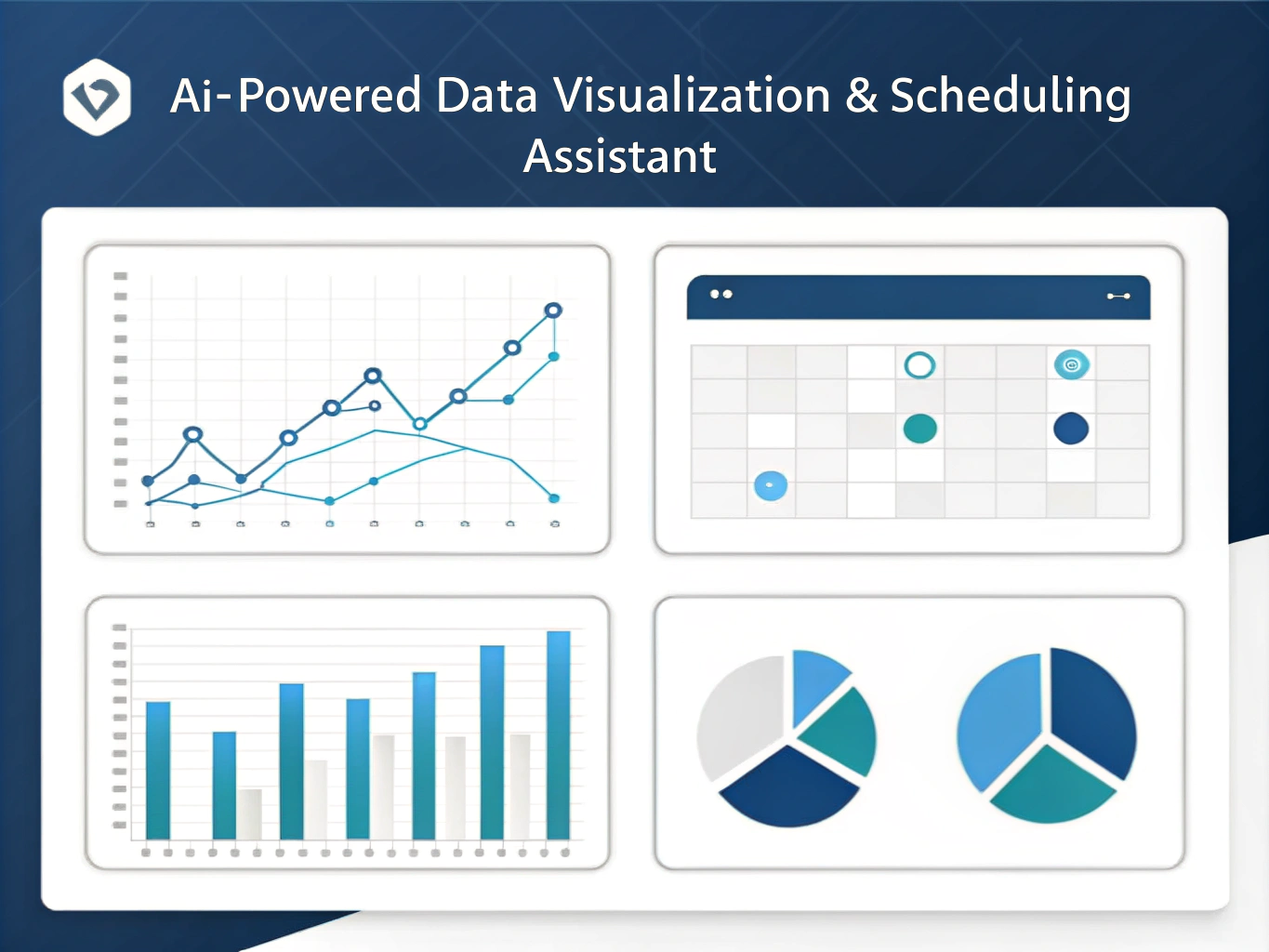
Step 1: Creating Your Data Visualization
Follow these steps to generate clear, professional charts from your data:
-
Select Chart Type: Choose the chart style that best represents your data. For example:
- Stacked Bar Chart to compare multiple parts within categories.
- Donut Chart for showing proportional data with a clear central focus.
-
Enter Your Data: Provide your data in one of the supported formats—CSV, JSON, or Excel-like syntax. For instance:
- CSV: “Month,Revenue,ProfitnJan,5000,1500nFeb,7000,2300nMar,6500,2100”
- JSON: {“labels”: [“North”, “South”, “East”], “values”: [300, 450, 200]}
-
Optional Customization: Tailor your chart’s colors, labels, or layout using this field. Examples include:
- colors: #4287f5, #f54291; title: “Quarterly Performance”; legend: top
- labels: “Months (X-axis)”, “Sales (Y-axis)”; gridLines: show
Step 2: Managing Appointments
Use the appointment scheduler to handle your meeting needs:
- Choose an Action: Select whether you want to schedule, reschedule, or cancel an appointment.
-
Specify Appointment Details: Fill in the date, time, participants, and time zone. Try these examples:
- Schedule: Date: 2024-07-15, Time: 09:00, Participants: Maria Lopez, David Kim
- Reschedule: Old Date: 2024-07-10, New Date: 2024-07-20, Time: 11:00, Participants: Emma Clark, Nathan Green
Step 3: Generate and Review Your Results
Click “Generate Results” after completing the form. The AI will process your inputs and provide:
- Beautifully rendered charts with interactive features
- Appointment confirmation or updates aligned with your calendar preferences
Introduction to the AI Assistant for Data Visualization and Appointment Scheduling
The AI-Powered Data Visualization and Appointment Scheduler Tool combines data analysis with efficient scheduling, helping you present information clearly and manage meetings with ease. It simplifies translating raw data into insightful charts and automates appointment handling across time zones, so you save time and reduce errors.
This tool supports multiple data formats and customizable options, adapting to your specific needs. Whether you need to illustrate sales growth or organize team meetings worldwide, it equips you with an intuitive interface backed by AI-driven processing.
Purpose and Key Benefits
The tool serves two core purposes:
- Visualize Data: Quickly convert complex data sets into charts that highlight trends and patterns.
- Manage Appointments: Simplify scheduling by automating actions like scheduling, rescheduling, or canceling meetings.
Using this assistant offers practical benefits such as:
- Streamlined workflows by integrating visualization and scheduling in one platform
- Improved clarity when communicating data-driven insights
- Flexibility with chart customization and time zone handling
- Reduced scheduling conflicts and better appointment coordination
Practical Usage of the AI Tool for Data Visualization and Appointment Scheduling
Visualizing Multi-Series Data for Better Insights
For example, imagine you want to analyze website traffic from different sources over several months. You could input data like this:
CSV Format:
“Month,Organic,Referral,Social”
“Jan,1200,300,450”
“Feb,1300,280,500”
“Mar,1250,320,480”
The AI Assistant generates a multi-series line graph that distinguishes the contribution of each traffic source, improving your understanding of trends over time.
Handling Complex Appointment Scheduling Across Time Zones
Suppose you coordinate a meeting between team members located in different parts of the world. For instance:
- Schedule a weekly progress call with Anna (Berlin), Liam (Sydney), and Carlos (Mexico City) on a date where all can join during their local working hours.
The AI tool accounts for relevant time zones and suggests meeting times that fit everyone’s availability. It also manages reschedules or cancellations seamlessly, sending notifications to participants.
Example Use Case: Generating Sales Overview Chart
Input data in JSON format for quarterly sales per region:
{“labels”: [“Q1”, “Q2”, “Q3”, “Q4”], “datasets”: [{“label”: “North America”, “data”: [50000, 60000, 55000, 70000]}, {“label”: “Europe”, “data”: [45000, 49000, 52000, 58000]}]}
The AI generates a comparative bar chart showing sales growth across regions, allowing you to present a clear performance summary.
Optimizing Your Workflow with This AI-Powered Tool
By using this AI Assistant, you improve productivity by:
- Saving time on manual chart creation and appointment coordination
- Reducing errors in scheduling and avoiding overlaps
- Accessing responsive, interactive charts that adapt to your data needs
- Integrating your appointment management with popular calendar tools for seamless updates
This combination of automated visualization and streamlined scheduling empowers you to focus on analysis and decision-making, rather than administrative tasks.
Important Disclaimer
The calculations, results, and content provided by our tools are not guaranteed to be accurate, complete, or reliable. Users are responsible for verifying and interpreting the results. Our content and tools may contain errors, biases, or inconsistencies. Do not enter personal data, sensitive information, or personally identifiable information in our web forms or tools. Such data entry violates our terms of service and may result in unauthorized disclosure to third parties. We reserve the right to save inputs and outputs from our tools for the purposes of error debugging, bias identification, and performance improvement. External companies providing AI models used in our tools may also save and process data in accordance with their own policies. By using our tools, you consent to this data collection and processing. We reserve the right to limit the usage of our tools based on current usability factors.